

How many chart types does Excel offer and what are they used for?
It's often said that “a picture is worth a thousand words". So, why not make the most of what spreadsheets have to offer and turn figures into visuals that are more comprehensible? With the different types of charts available in Excel, you can easily turn numbers into appealing diagrams. But, how many chart types does Excel offer?
Remember that visual content is the key to understanding and memorising. For example, how would you prefer to monitor your sales performance over the past two years: in a list of 24 rows with multi-digit data or on a graph with 24 bars corresponding to those figures? In the second case, you are sure to pick out the ups and downs much faster, as well as the overall annual fluctuation.
And there's no need to be an economist, finance expert or accountant to take advantage of this software; any professional worth their salt needs a solid understanding of Excel. In fact, according to one study conducted over 10 years by Harvard University, workers, regardless of their field of activity, spend 10% of their working day on this computer program. This percentage rises to 30% in the case of professionals in the financial sector.
Excel is unquestionably the go-to software when it comes to calculating, analysing, organising and interpreting data. When you learn to use it, you'll notice an improvement in your productivity and efficiency, even on a personal level. So, how many chart types does excel offer exactly? Read on to discover all.

What are Excel charts?
Charts are a way to represent data using visual resources that help us to understand the mathematical or statistical relationship between the different data used.
Excel, the spreadsheet software par excellence, would not be complete without this feature, enabling you to transform numerical data into images at the click of a few buttons. In this way, you will be able to visually display data so it can be better understood. In other words, all you need to do is select the different values and pick the type of chart you want to use; the program even gives you recommendations.
These can be found under the "Insert" tab on the toolbar. In addition, once the chart has been created, Excel allows you to configure its appearance, with the option to customise the colours, style, 2D or 3D format, titles and legends, choosing exactly which elements you want to be displayed.

How many chart types does Excel offer? Examples
The key to making the most of this feature lies in understanding how many chart types Excel offers and what each one is used for. For example, to depict the distribution of a Twitter profile's followers by country, you might use the typical bar chart, where each bar is a different nationality and its height represents the number of followers. However, for such a purpose, a better chart to use would be a map chart, which features a world map with the countries in different colours according to the number of followers.
So, how many different chart types does Excel offer and what can you represent with them? Discover everything Office has to offer and find the visuals that best fit your data.
Column charts
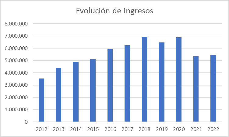
This is one of the best-known types of chart in Excel. It consists of a set of columns that represent different categories on the horizontal axis, the height of which - the vertical axis - varies in line with a given data set. For example, imagine you want to visualise changes to revenue at your company over the last decade. On the horizontal axis, you will include the various years, while on the vertical one, you will assign the amount of revenue for each one of these.
You can also use the grouped columns subtype, meaning that each category on the horizontal axis includes 2 or more columns. This would be the case, for example, where you want to view expenses as well as revenue, in order to quickly identify which financial years have been profitable.
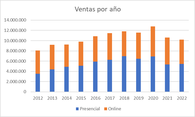
Another option with this type of chart is stacked columns. In this version, instead of two different columns, both values are displayed within the same column, albeit in different colours. This type of Excel chart is used when you want to prioritise the sum of the two values but also want the two figures to be depicted individually. You can use this, for example, if you want to monitor your company sales, for which you might further divide each column into sales from physical stores and the online store.
Bar charts
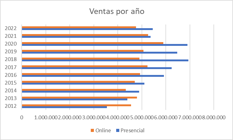
Bar charts are very similar to column charts and can be used for the same purposes. The only difference is that the categories appear on the vertical axis while the values are displayed on the horizontal axis, as rows. This means they are read from top to bottom, rather than from left to right. As with the previous case, you can also use the subtypes of grouped and stacked bars.
Note that this format is useful when the sums involved are not very high, and you're not including the parameters from the horizontal axis, because otherwise, the ranges will be too close and will be difficult to read, as you can see in the following sales example.
Line graphs
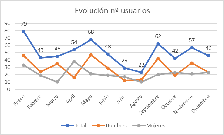
Among the different types of charts available in Excel, this category is the best to display trends and developments in data at identical intervals. To do so, the software takes the values as points of reference which it connects with a straight line.
So, a small gym business can quickly visualise changes to the number of users per month and at a glance, check client behaviour at certain times of year. More lines can even be added to create comparisons. For example, in addition to the total number of users, the gym owner might want to visualise trends by gender.
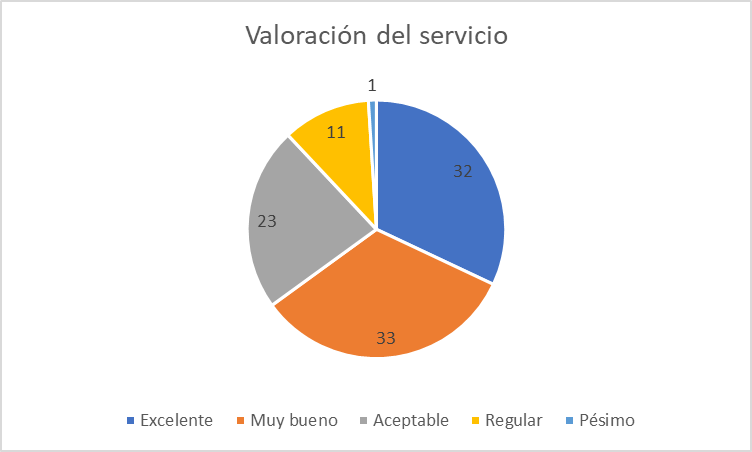
Pie charts
These look just like a pie or cake, making them perfect to highlight the percentage distribution of a whole. They prove very handy in a range of professional fields: from how total expenditure is spread in the financial sector, to which products customers buy most. However, they're not suitable for values of less than zero and it's important not to add too many slices to the "pie", or they will be too vague.
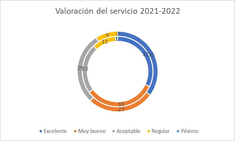
Doughnut charts
Got more than one set of percentages to compare? In such cases, the best types of chart to use in Excel are the so-called doughnut charts. These are similar to pie charts, i.e., they allow you to view the relationship of the parts to the whole, but with the option of including various levels of rings, or doughnuts. Following on from the previous example, with two doughnuts you can depict the ratings for service in recent years.
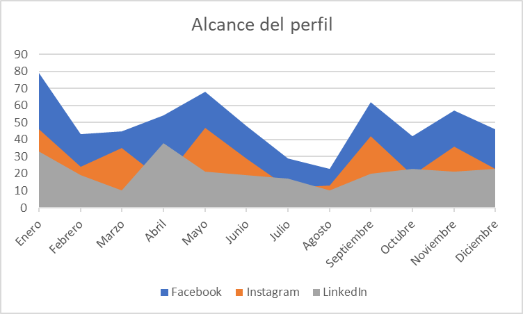
Area charts
Area charts are a bit more complex. They tend to be used to plot changes to various items over time and to highlight an overall trend. By showing the sum of the figures included, area charts also depict the relationship of parts to a whole. This type of Excel graph is common in social media monitoring reports, for example, to demonstrate share across the different platforms.
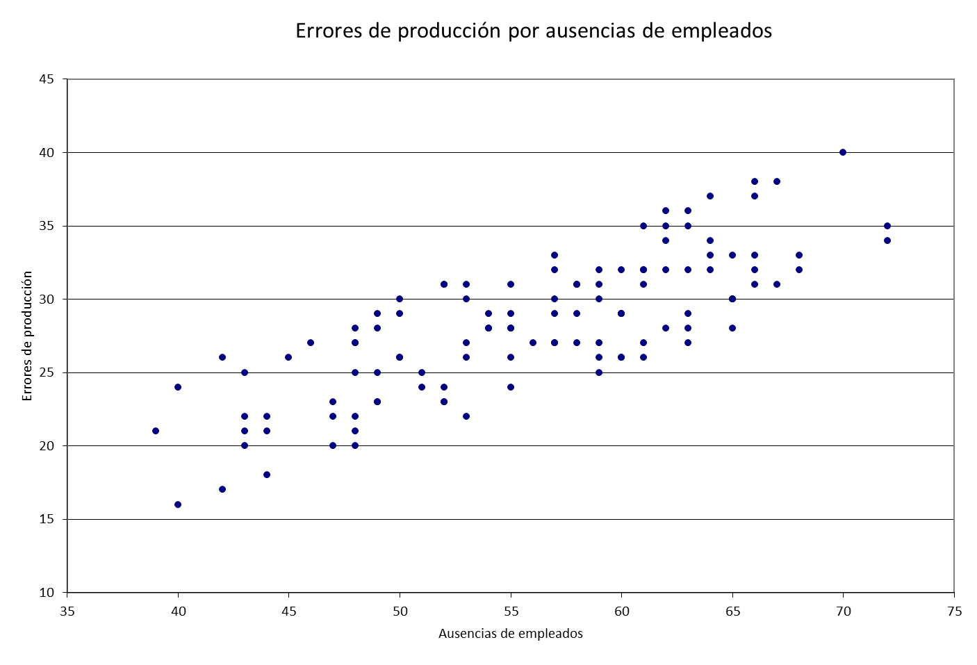
Scatter charts
This option will prove useful if you need to compare one set of data with two different characteristics, which go on axes X and Y. The result is a grid in which you can see exactly where each item is. It might be that you want to compare the output volume at a factory against the number of maintenance hours, the price of a product against its gross margin, and, as in this example, the number of production incidents against staff leave.
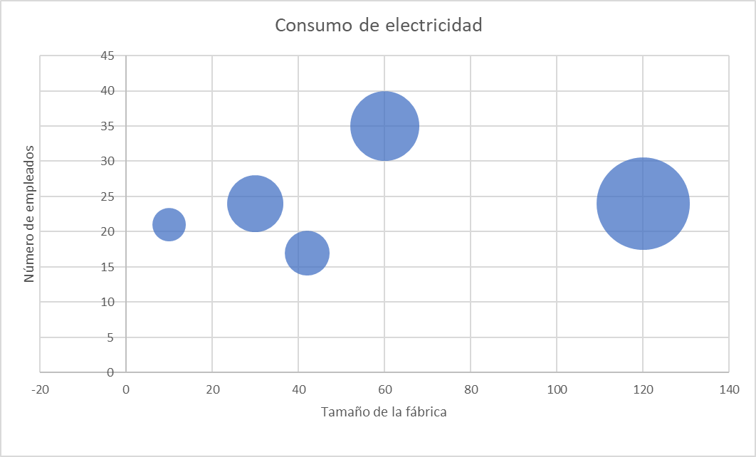
Bubble charts
These take scatter charts one step further. How so? Because besides comparing two different factors, you can also create a third variable with each value. As a result, instead of dots that are equal in size, you get a graph with bubbles whose size varies according to the relevant sum. For example, imagine that you want to visualise the electricity consumption of your various production centres as well as accounting for the number of employees and the factory size to identify operational imbalances.
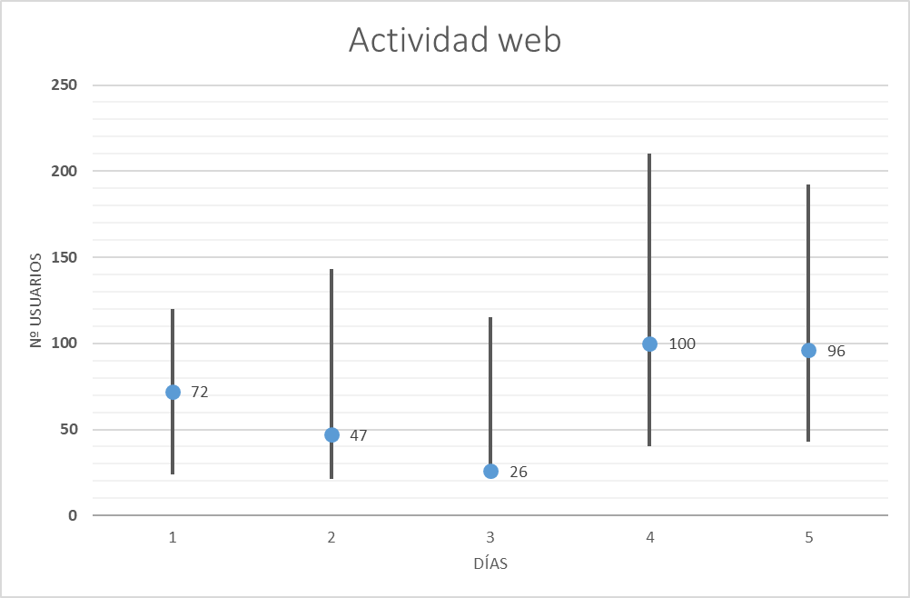
Stock charts
As the name implies, this chart type is designed to reflect fluctuations in stock prices within the stock market, reflecting three or more variables such as the opening, closing, maximum and minimum prices. However, that's not the only thing they can be used for, as they're also useful for capturing these ups and downs in any other area, such as daily rainfall or annual temperatures. For example, you can use them to track website activity, indicating the average, maximum or minimum number of users connected at any given time each day.
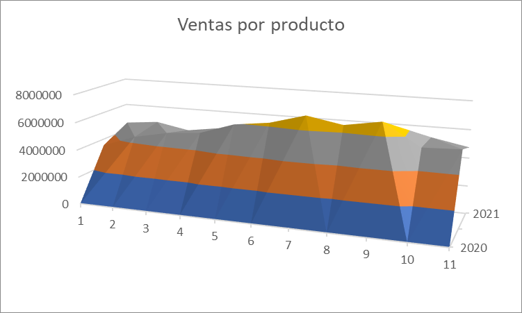
Surface charts
These are contoured diagrams on which the colours and patterns indicate areas within the same range of values. They're based on topographical maps, although they can be extrapolated to any other corporate aspect that requires the combination of several data sets with dissimilar values. A word of caution however: these charts are some of the most complex in Excel, so make sure yours can be understood. In this case, for example, you can see the number of sales for each product (represented by numbers) in the last two years.
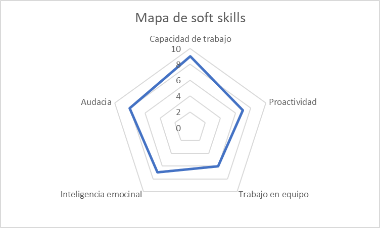
Radar charts
Also called spider charts, this graph type is designed to highlight the value of certain elements in relation to a central point. Thus, a polygon shape is generated with as many corners as elements input. As an example, it might be used to create comparisons between different candidates for an HR job.
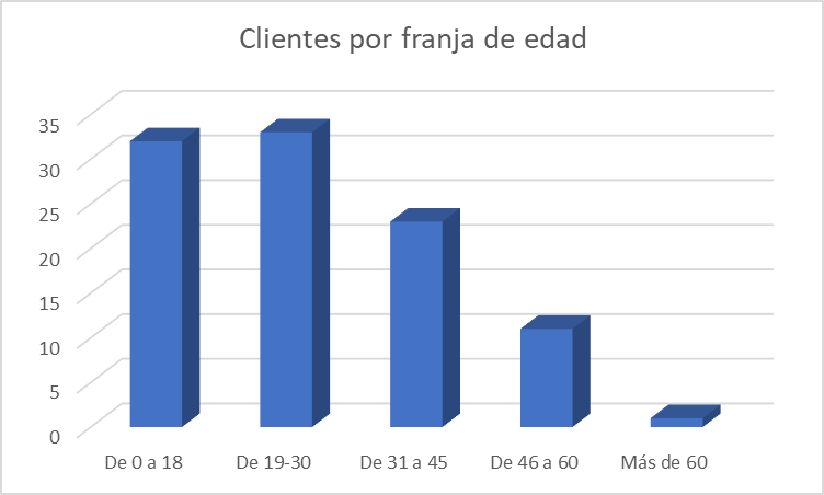
Histograms
Besides these graphs, Office has released new types of charts for Excel. So, for versions from 2016 or later, new options are available, as outlined below.
The first of these, the histogram, may at first glance look like a simple bar chart, however here, there is no comparison of categories or trends over time. Rather, each bar depicts how data from a single category is distributed. To do this, the data is grouped into intervals and a tally is calculated for each interval.
You've probably seen this before with population statistics, which feature bars for the different age ranges. You can do the same yourself in a business context, presenting data on the public by generation. For example, lead capturing software from your shoe shop allows you to access a database holding each customer along with their age. Displaying a bar for every year can be a bit much, so with this chart, they can be covered in several blocks within ranges.
Hierarchy charts
In this case, the aim of the visual representation is to identify the hierarchy of certain factors. Also known as organograms, they use boxes varying in size according to their importance to demonstrate connections. Imagine you manage a restaurant and want to quickly visualise which meal deals are most popular with the customers... this is a great way to do just that.
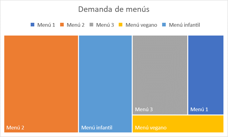
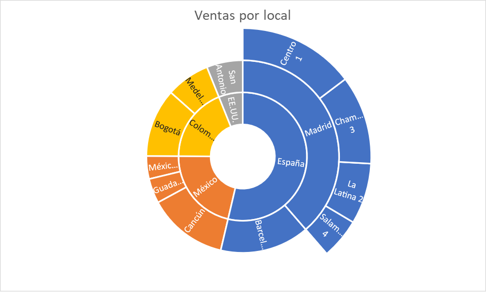
Sunburst charts
Maybe your hierarchy isn't limited to a single level, but rather, within each group there are subgroups. For such scenarios, you can use this type of chart featuring rings that grow with each new level of hierarchy. Note that each box will also have a specific size depending on its value in the table. Graphs of this type might be used to plot the volume of sales at each branch of a small but international restaurant chain, for example.
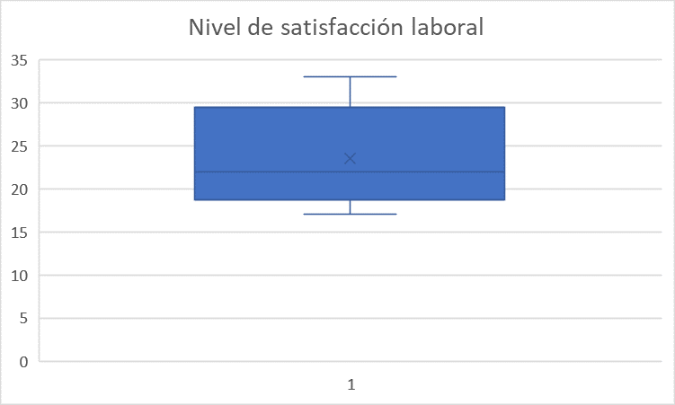
Box and whisker charts
In this instance, you can visualise average data and outliers within data divided into quartiles. This graph type is often used to analyse research results, for example from a job satisfaction survey, as you can easily see the average, maximum and minimum deviations represented by that vertical line.
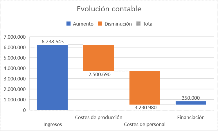
Waterfall charts
This type of Excel chart can be used to plot the running total of certain data when adding or subtracting values from an initial sum. It can be used to understand how a baseline changes in accordance with certain factors, such as in the case of a company's finances.
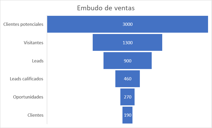
Funnel charts
This format is designed to depict values arising at various stages of a process. Hence they prove very useful in the field of marketing, to visually display sales funnel data, for example.
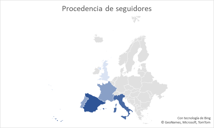
Map charts
Got geographical data? If yes, then your best option is to put it into a map chart, with which you can capture data or categories within a map of the countries, regions or cities in question, using colours. For example, if a social media mogul needs to identify the origin of their followers to understand when is best to publish posts, then by using this chart, the distribution can easily be pictured.
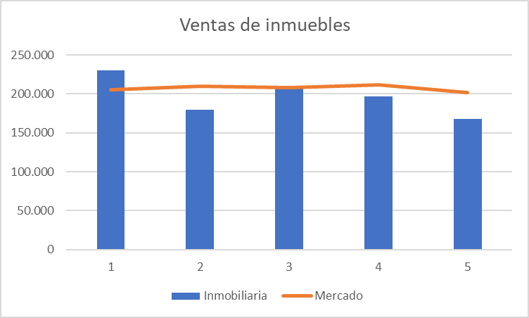
Combination charts
This final chart type in Excel features a combination of two or more different graph types, as long as the data is organised into columns and rows. Here, an estate agent might capture the average monthly sales price of its properties using bars, alongside displaying average prices on the housing market.
As you can see, there are many ways of turning figures into images. Now that you know how many chart types Excel offers, it’s time to learn how to use them and you will make your activity reports and analyses more appealing and easier to understand, both for you and the rest of their users. This knowledge will also have a positive impact on your job prospects or in-company promotions. Indeed, were you aware that, according to a study by Capital One and Burning Glass Technologies, certified Excel skills increase salaries by an average of 12%?

Do you want to develop professional skills that will help you access better job opportunities? Discover Santander Open Academy, the training space you need to keep growing.
Join our global platform for learning and professional development and access courses at zero cost, training content in a wide range of formats and scholarships from leading universities and institutions.
If, like us, you believe that we should never stop learning, sign up here and find out what we have for you!

More posts to read...
-
 22/07/2025 | Santander Universidades
Crossing borders to study: new allies on the university journey
Card text -